

Client Brief: The Bay – Caravan Holiday Stay
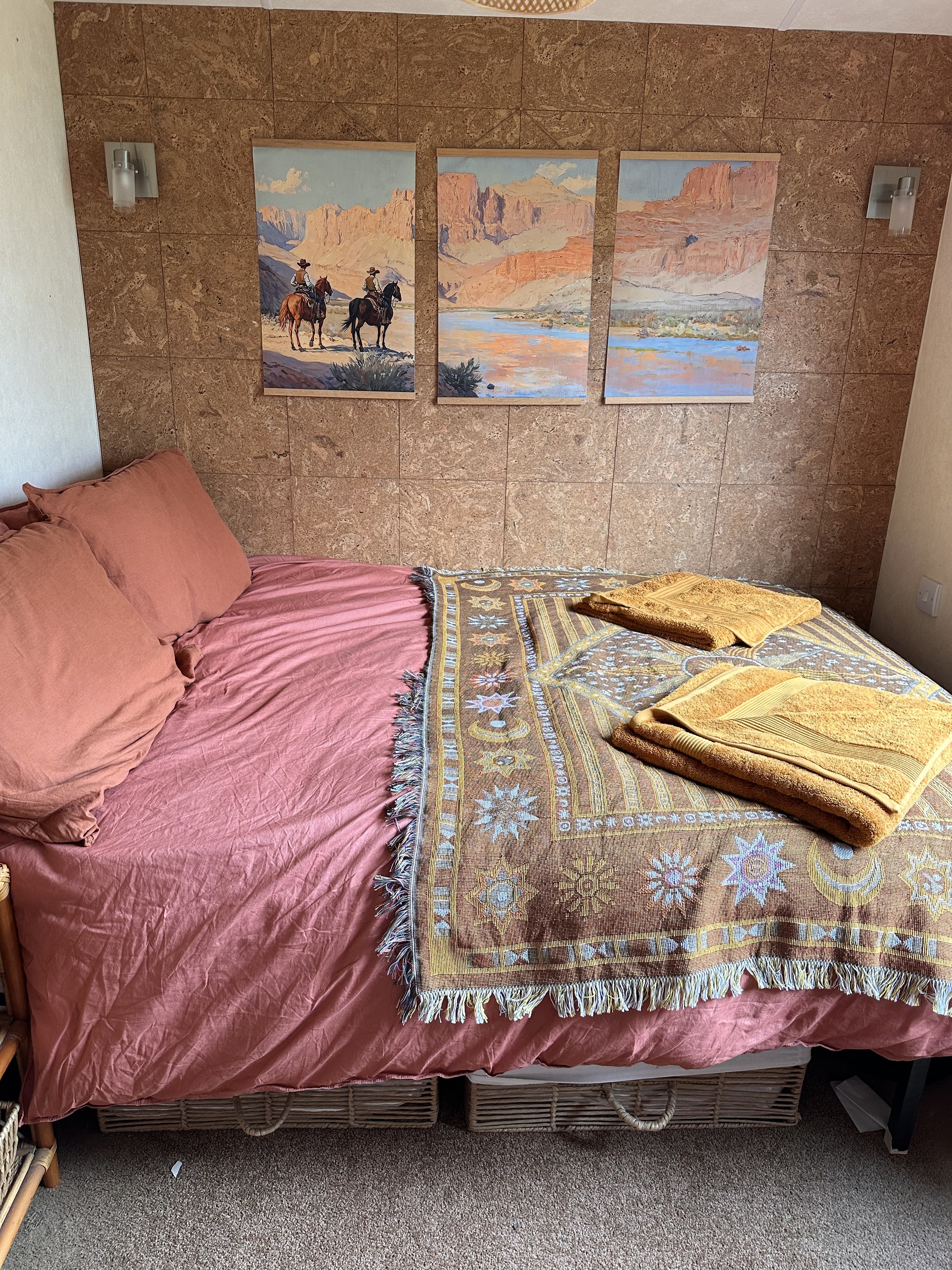
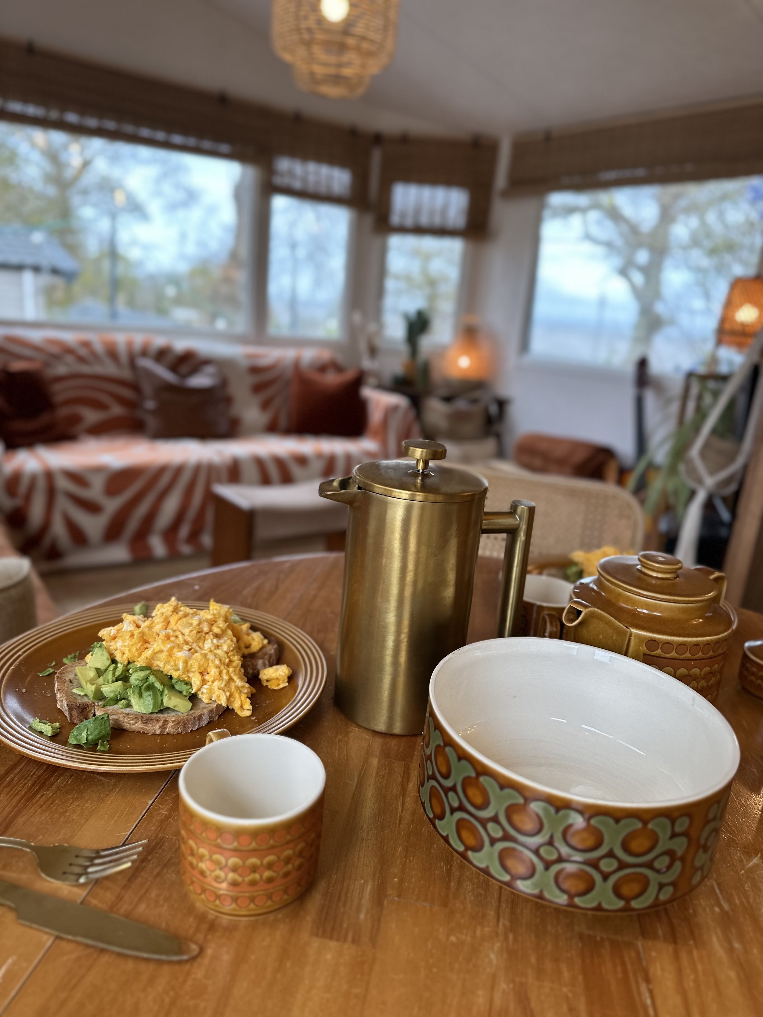
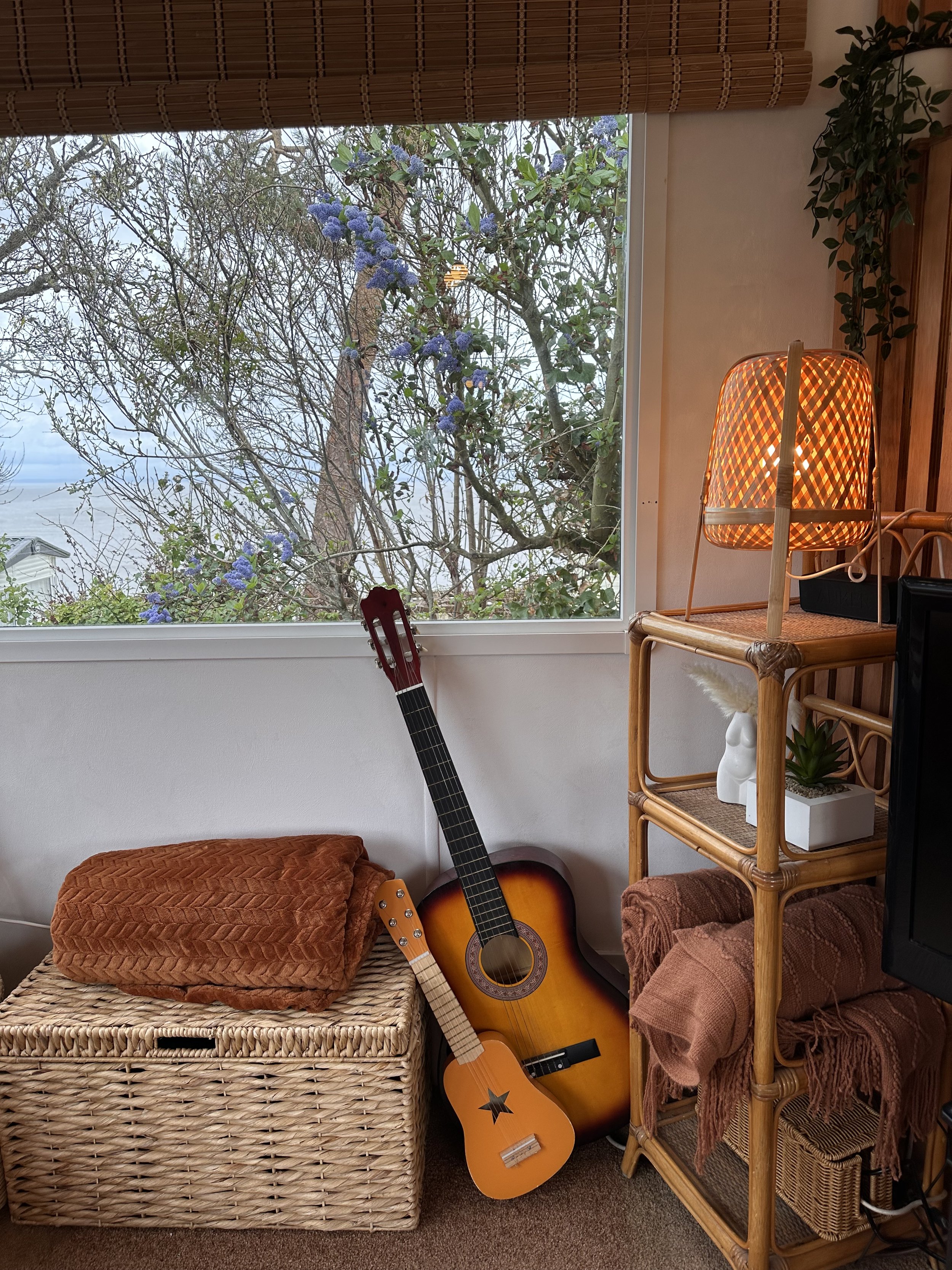
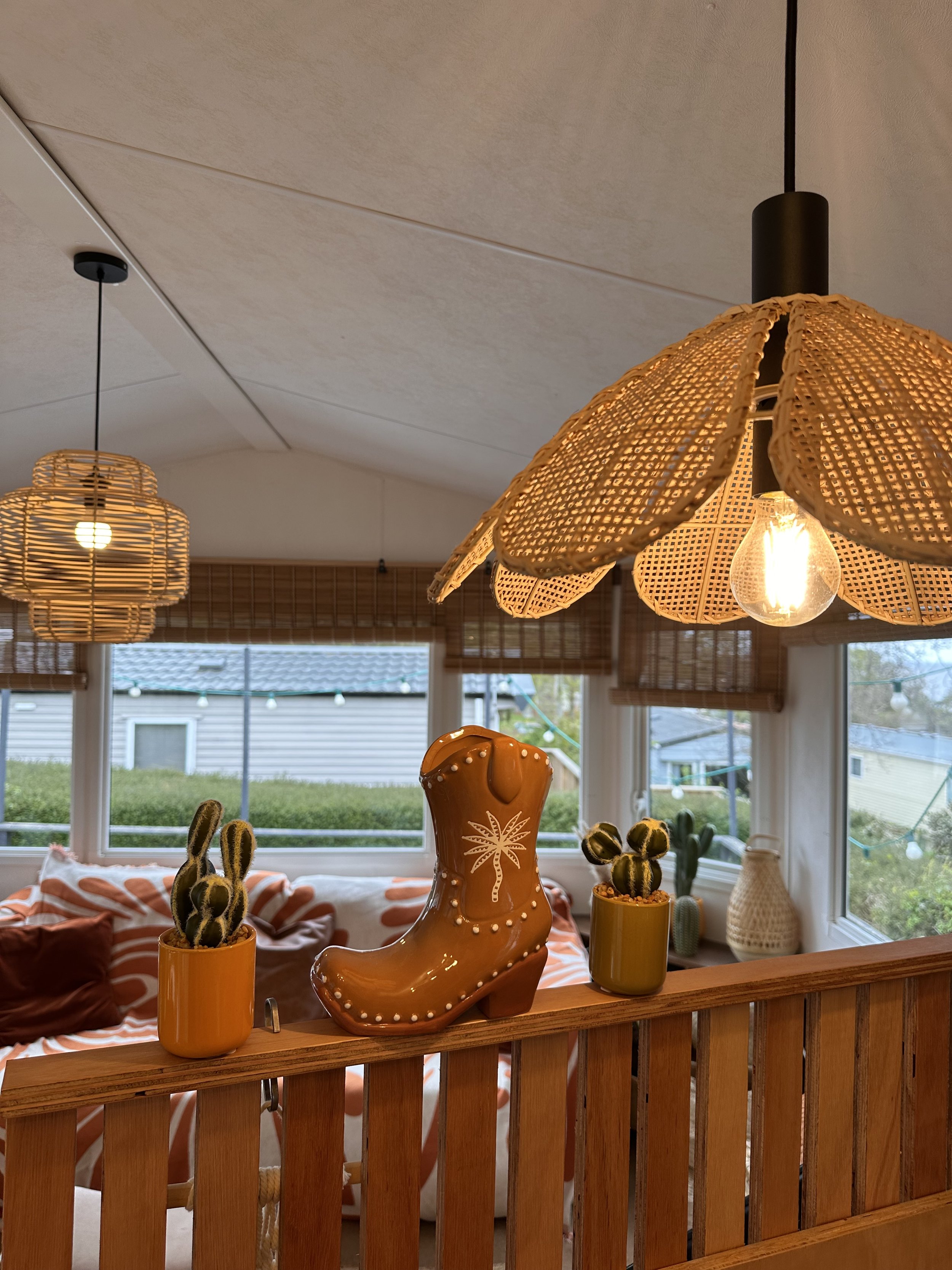
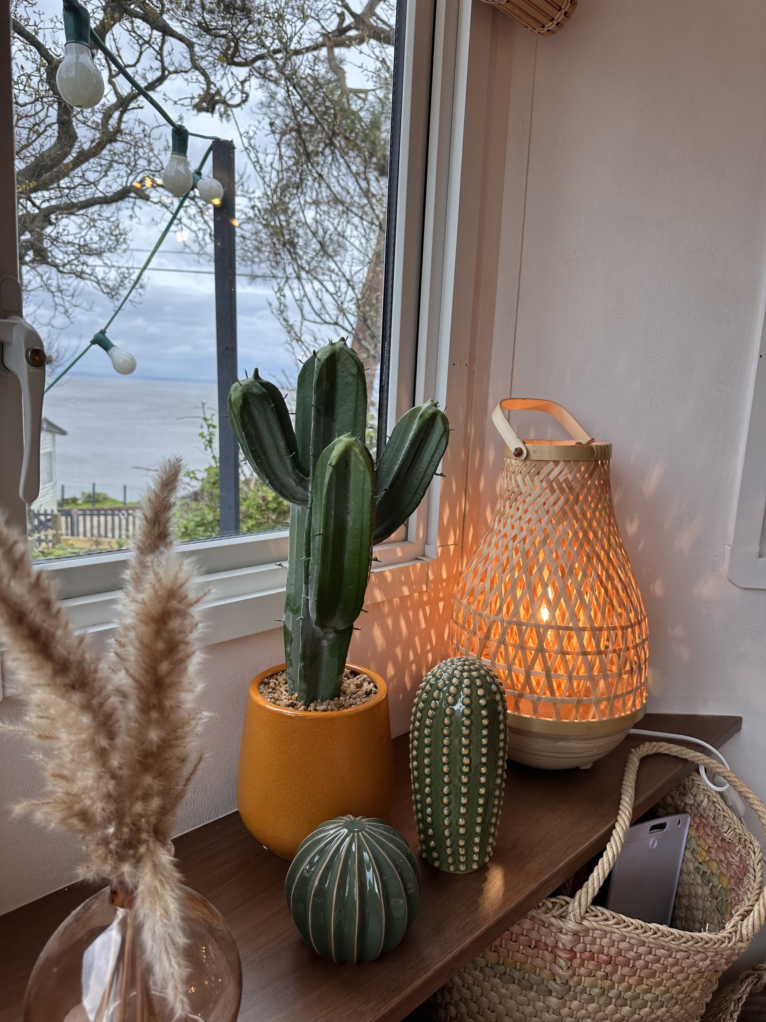
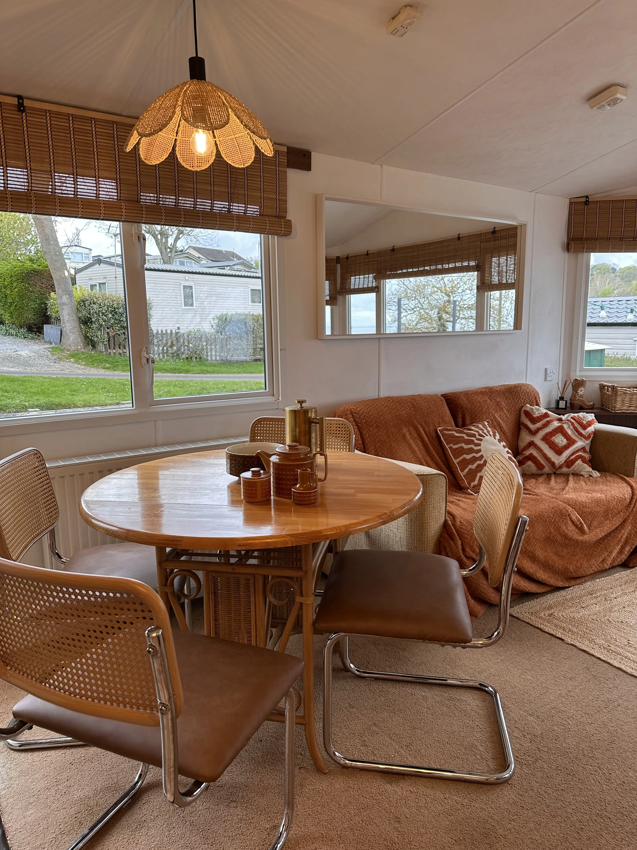
The client approached me to design a distinctive and inviting interior for their holiday rental located at St. Audries Bay. Inspired by the natural tones and textures of the surrounding coastline, the creative direction focused on a warm, boho beach aesthetic with hints of desert chic.
The brief was to transform the caravan into a unique, memorable space that would not only feel cozy and well-curated for guests, but also stand out visually on platforms like Airbnb. To achieve this, I developed a design concept rooted in soft sun-bleached tones, textured natural materials, and playful, retro-inspired branding that captures attention at a glance.
The outcome is a bold yet relaxed holiday retreat, where every element—from the colour palette to the decor—has been thoughtfully crafted to enhance the guest experience and elevate the property’s presence online.
Logo Design & Interior Styling

Total Style Overhaul
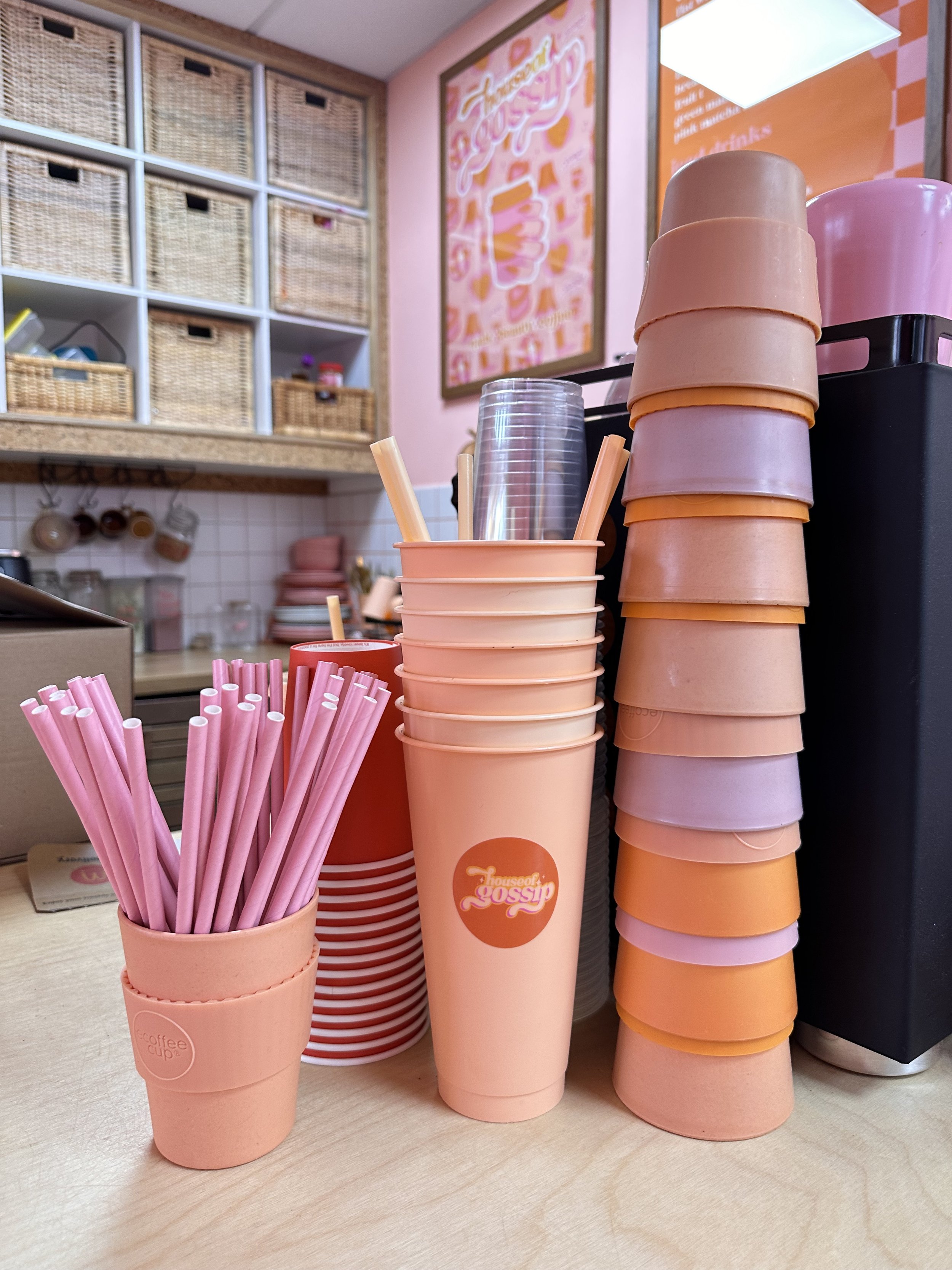
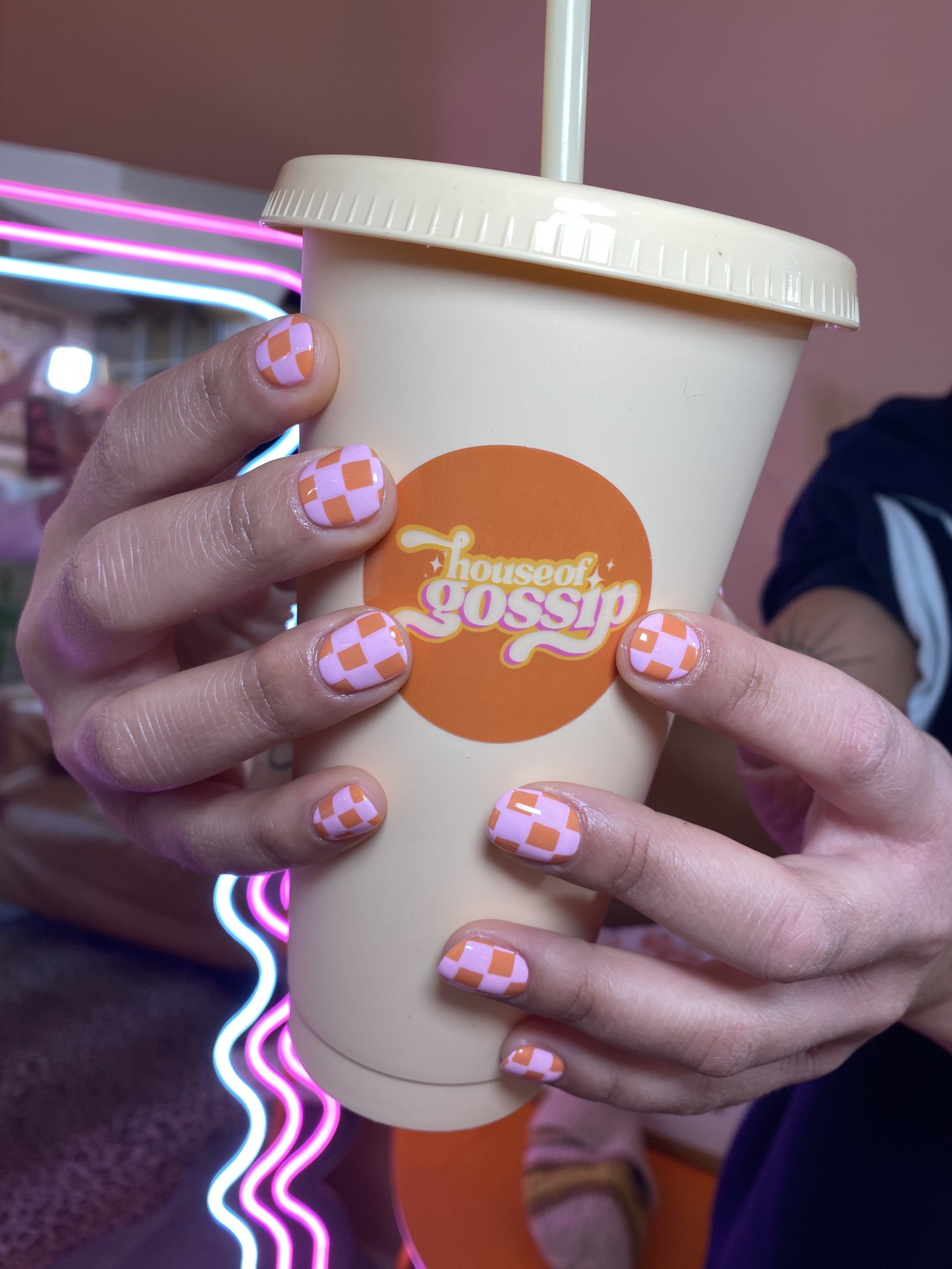
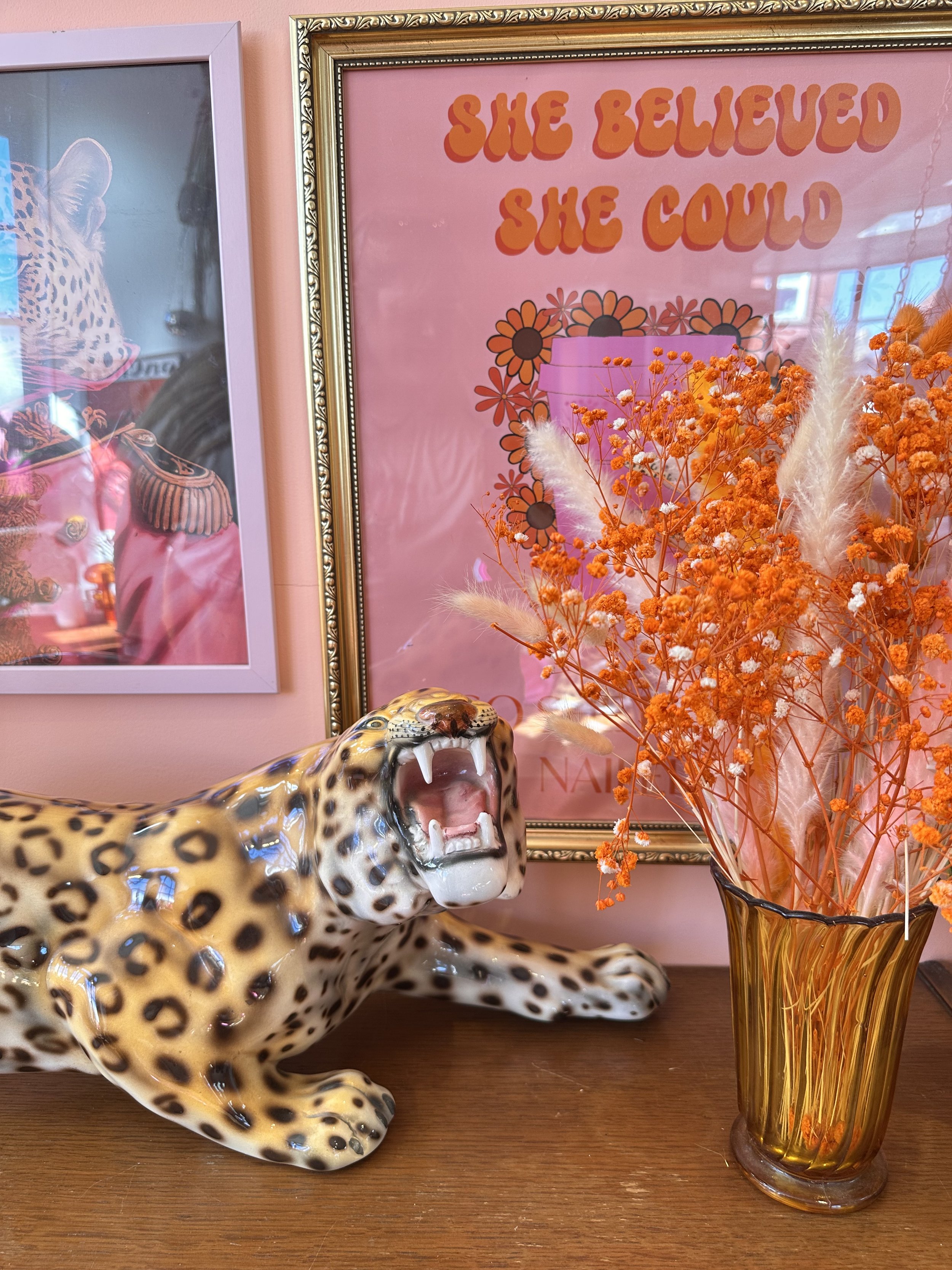
Project: House of Gossip – Rebrand & Interior Identity
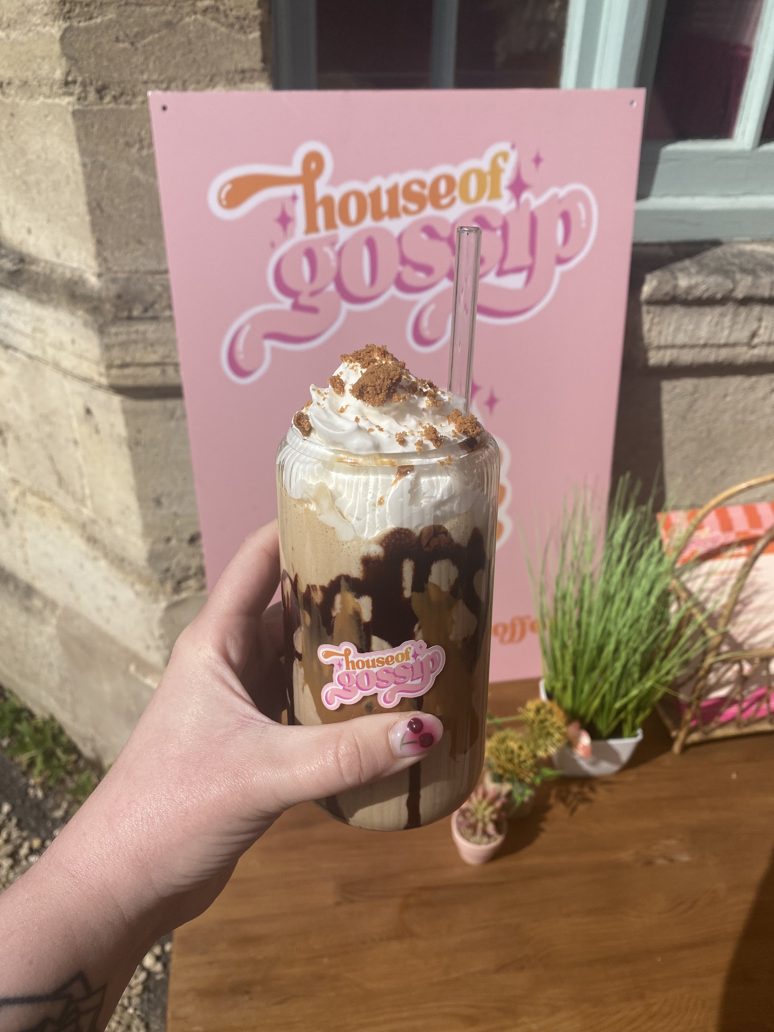
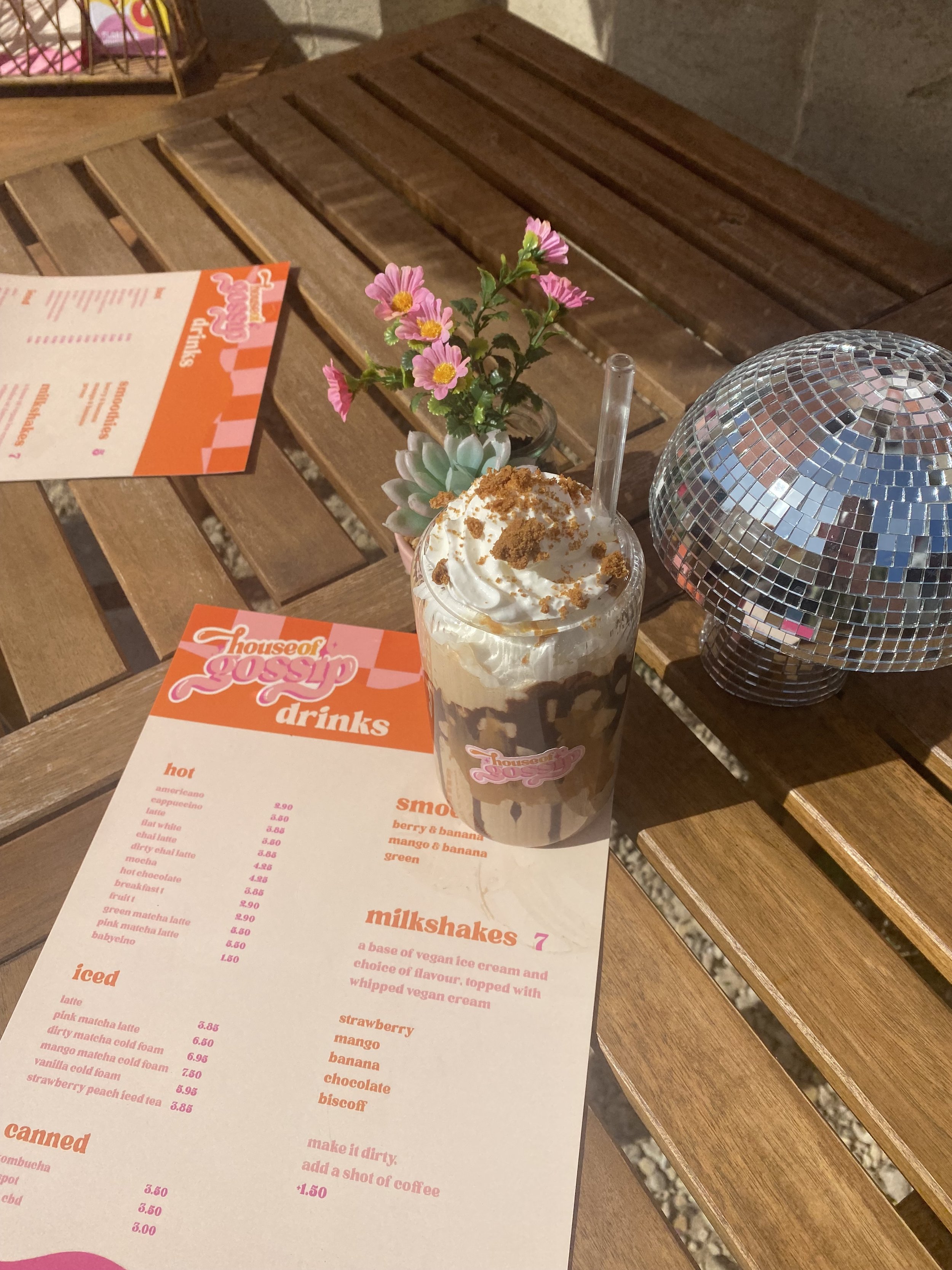
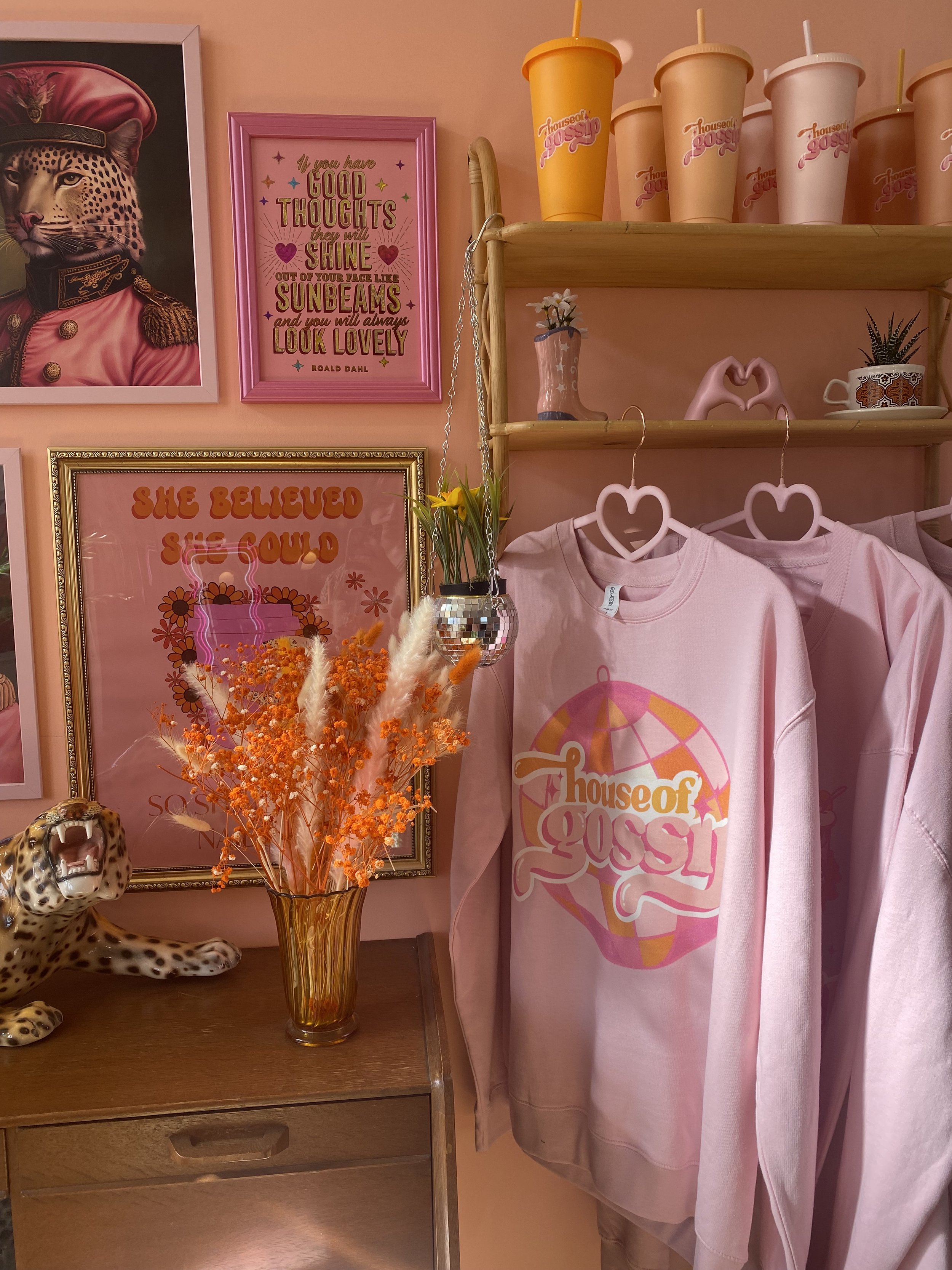
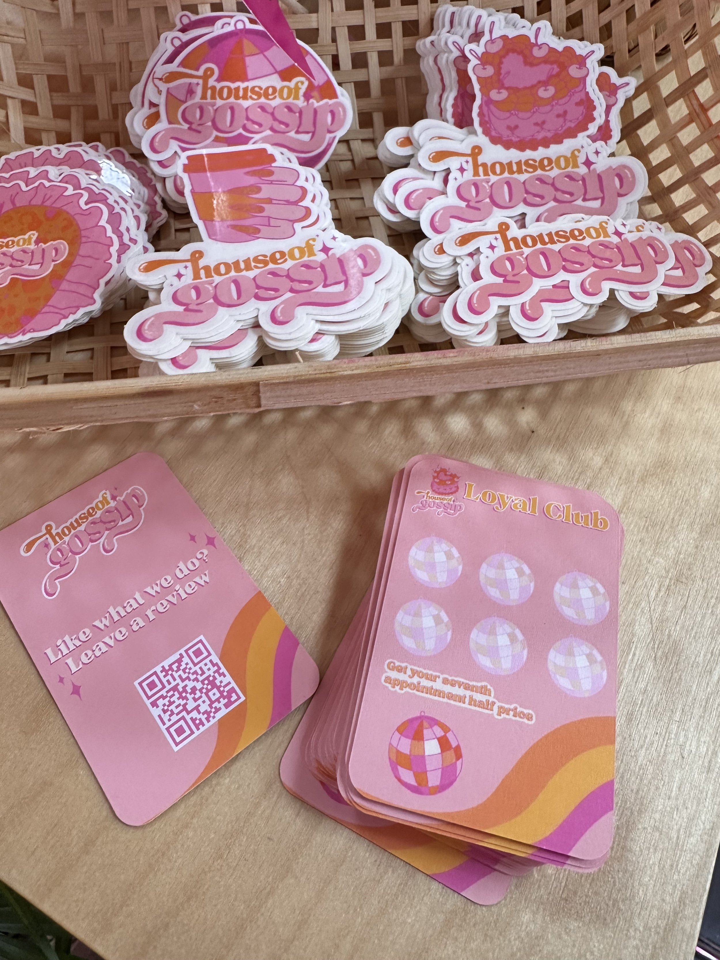
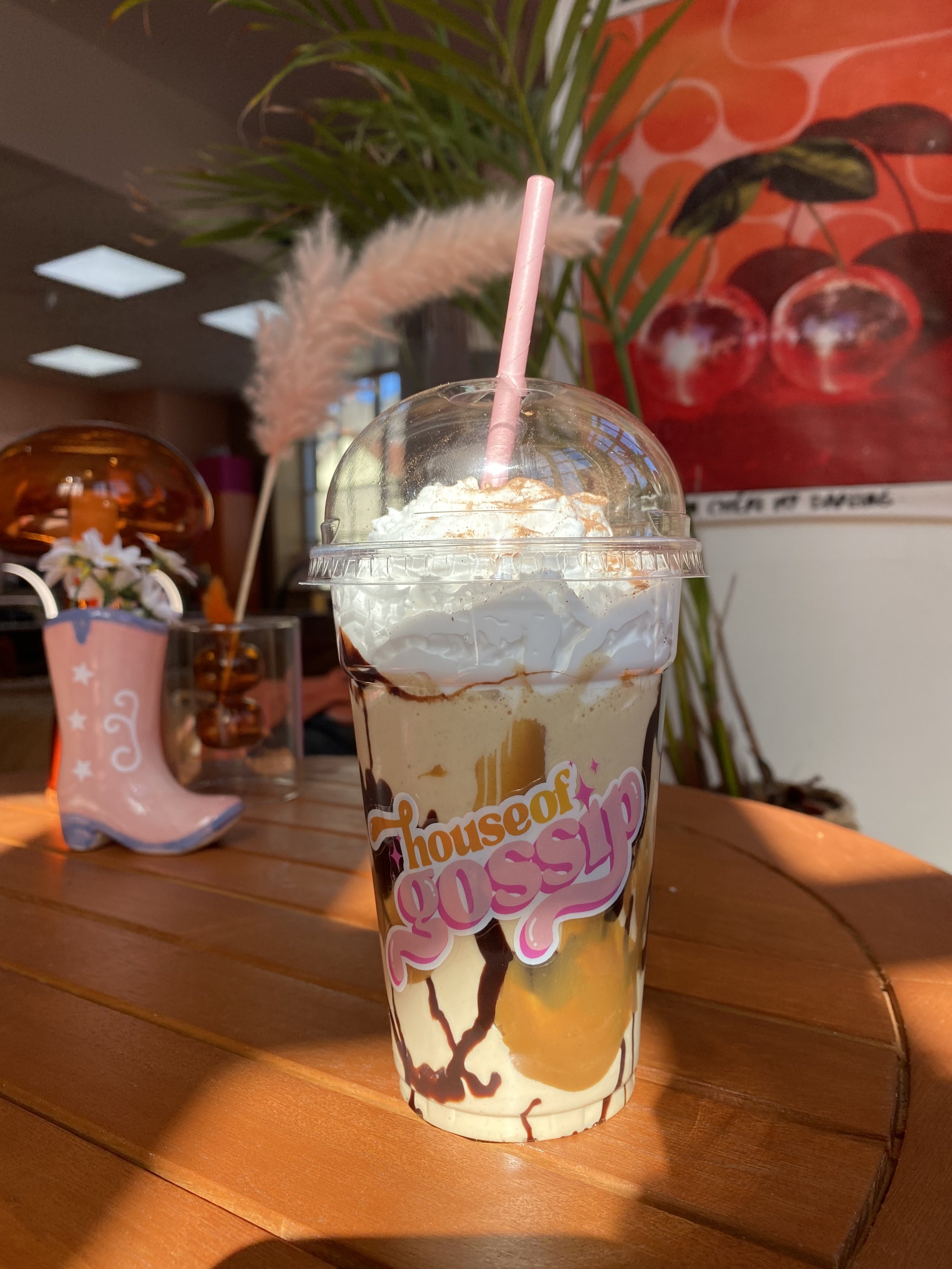
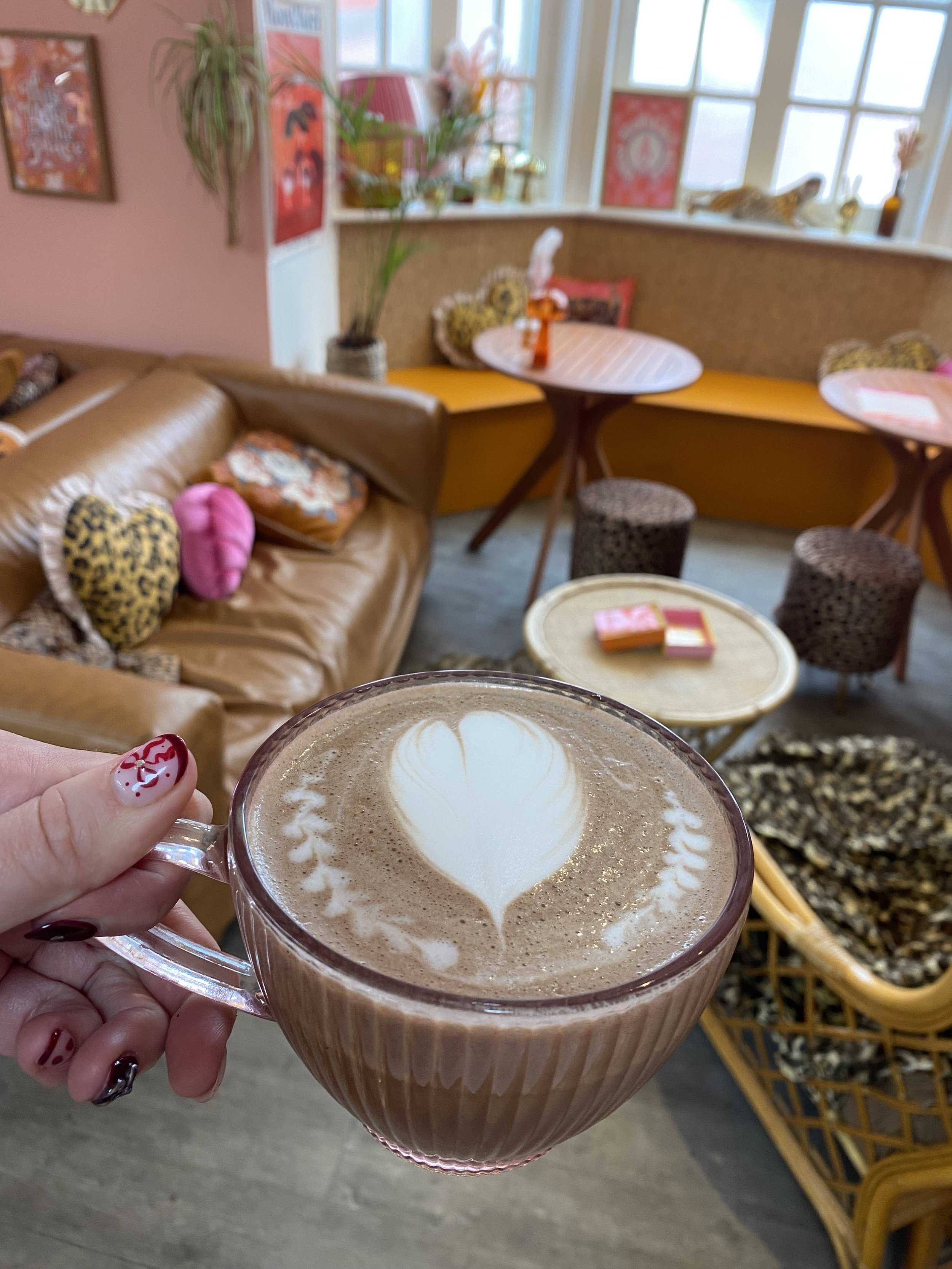
House of Gossip is my own concept brought to life — a hybrid space combining nails, beauty, and café culture under one bold, playful roof. The brand is rooted in a nostalgic 70s café aesthetic with a boujee twist: think checkerboard tiles, punchy pinks and oranges, retro curves, and a sense of cheeky luxury.
This was a full rebrand and interior styling project, where I developed the entire creative direction — from logo design and visual identity to the physical styling of the space, even designing and launching branded merch.
The result is a vibrant, multi-sensory experience that feels like walking into a scene from a vintage magazine — one designed to turn heads both on the high street and online.
Branding & visual identity, website design & social media guides & content creation
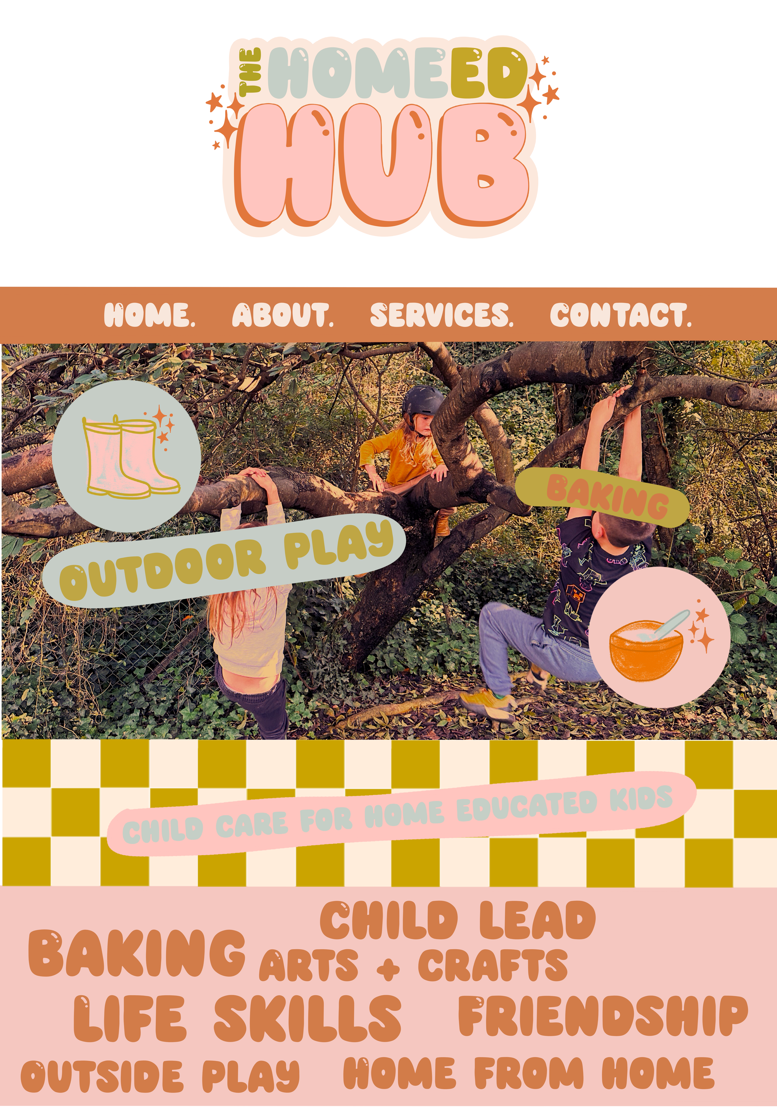
Project: The Home Ed Hub
The Home Ed Hub is a child-focused initiative designed to support home-educated children through creative, skill-building play in a nurturing environment. The client envisioned a look that felt fun and familiar — reminiscent of 90s kids’ TV shows — while maintaining a soft, modern pastel palette that appeals to parents and children alike.
I created a playful and approachable brand identity using chunky retro-style typography, organic illustration, and checkered patterns. The visual style has a subtle grunge texture to it, adding warmth and authenticity to the pastel tones. Every detail was carefully crafted to reflect the values of the project: child-led learning, outdoor adventure, baking, crafts, and community connection.
This was a full branding project, including logo design, web layout mockups, custom graphics, and social-ready visuals. The final result is a bold and nostalgic brand presence that feels both comforting and energising — like a hug wrapped in glittery wellies.